:strip_exif():strip_icc()/filestorage/images/84596/field-system-aesthetics-5-gan.jpg)
Introduction
At present, a Google image search of AI or data generates infinite clichéd stock images of glowing circuit boards in outer space or dystopian cyborg heads. When the media and brands repeatedly use this type of imagery to represent technological advancements, it perpetuates the idea that they have unknown powers that are too complex to comprehend.
This is problematic. A recent study by Pega found that more than 70% of consumers harbour some sort of fear of AI, and this is partly due to a lack of understanding of what exactly AI is and what it does. This knowledge gap has the potential to negatively shape consumers’ perceptions of new technologies. Consequently, how we brand and communicate these concepts needs to change to overcome this mistrust.
As ever more complex data systems drive our lives, our focus as designers and artists is to create new metaphors that help people, brands and institutions to talk about these abstract and intangible things.
Through the use of dynamic typography and responsive digital visualisations, progressive creative practitioners such as Field and Tendril are addressing this issue head on, and are establishing a new visual language that eradicates the current ambiguity. ‘As ever more complex data systems drive our lives, our focus as designers and artists is to create new metaphors that help people, brands and institutions to talk about these abstract and intangible things,’ explains Marcus Wendt, creative director at digital studio Field.
Trend Primer:
Context: Advances in technology have resulted in AI and data playing a key role in our society, yet most people do not fully understand these complex systems. As discussed in Morality Recoded, there is a lack of visual metaphors to represent these new abstract concepts, and the imagery typically used is purposely vague or dystopian.
Sectors: Branding, communications, advertising, packaging, fintech, art direction, retail
Treatments: Translucent abstract forms, CGI molecular textures, dynamic and informative moving typography, positive synthetic colours
Branding and communications
:strip_exif():strip_icc()/filestorage/images/91259/communication-p.jpg)
The branding and visual communication of complex yet invisible technology systems such as algorithms, AI and data are evolving to become more human, accessible and tangible than previous iterations. Through the use of evocative CGI animations, visual artists are using irregular textures and three-dimensional shapes to emphasise that AI and algorithms are not set forms, but are continually responding to new inputs of data.
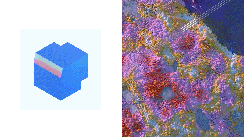
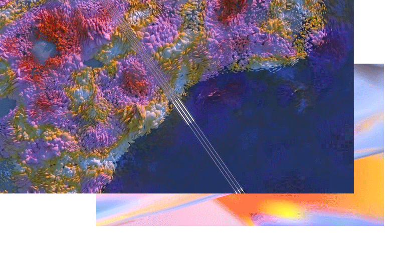
System Aesthetics by digital studio Field is an innovative visual exploration of how the fundamental forces that shape our society can be ‘translated into visual metaphors that can contribute to a public debate’. A series of films visualise neural networks as translucent blocks that show how algorithms see the world, making it easier for people to understand why they make certain decisions. Canadian design studio Tendril adopted a similar aesthetic in its branding campaign for Microsoft’s Ignite conference.Through the use of strong colour, layered shape-shifting blocks and translucent finishes, the film communicates the technology brand’s intelligent user interface (UI) and user experience (UX) design for its Office 365 suite of products.
As more intelligent systems shape our society, it is important that brands and creatives clearly express how they work. Creating a new visual language around these abstract entities will democratise how they are used and developed for our future society, and demonstrate their value.
:strip_exif():strip_icc()/filestorage/images/91331/colours.jpg)
From top: Virtual Gap Year by Pitch Studios for IAM; Microsoft Ignite branding by Tendril; System Aesthetics by Field; The Body by Waltz Binaire; Virtual Gap Year by Pitch Studios for IAM; The Body by Waltz Binaire
Typography
Designers are proposing a shift away from static typography to more reactive forms of lettering. Using dynamic block shapes that continually distort and reconfigure, this new generation of typography provides tangibility for real-time streams of data and the complex technology companies that operate in this field.
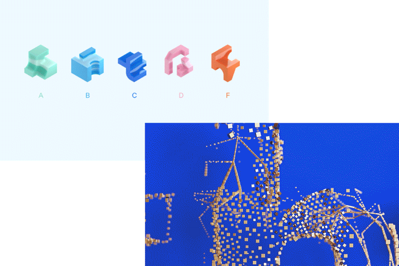
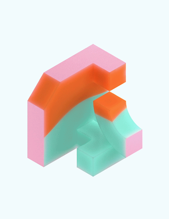
Renowned creative studio Pentagram has laid the groundwork for this new visual aesthetic with the brand identity it developed for AI-powered insurance company Cytora. Through the use of CGI, infinitely moving modular forms in shades of turquoise blue, pastel pink and orange morph and change shape to reflect the brand’s deeply technological processes. Pentagram’s aim was to demystify Cytora’s technology and portray it in an accessible way by visualising how it operates through informative visuals, rather than focusing on the end product. The fluid typography created by Foam for IBM’s recent Think festival champions a similar concept, but instead mixes organically moving liquid, sand particles and rendered materials in its creative execution.‘We wanted the visuals to be a reflection of a provocative, flexible and practical system that asks us all to think,’ explains Henrik Mauker, co-founder of Foam.
As first discussed in Programmable Realities, responsive typography challenges the static nature of traditional branding and enables brands to communicate with consumers much more organically through continually evolving messages. The informative aesthetic communicates complex systems in a transparent way, generating trust and understanding.
:strip_exif():strip_icc()/filestorage/images/91332/colours2.jpg)
From top: Cytora by Pentagram; IBM Think festival by Foam; Cytora by Pentagram; IBM Think festival by Foam
Experience design
:strip_exif():strip_icc()/filestorage/images/91266/experience-p.jpg)
Physical and mobile digital experiences are enabling users to access intelligent technological systems on a physical level, and fully comprehend how data responds to them as individuals. ‘Although data can be depicted on flat screens, being able to manipulate data in augmented 3D space makes it easier and more efficient to detect patterns,’ Alfredo Ruiz, design lead at IBM, tells Venturebeat. This real-time interaction and manipulation is not only a gratifying experience, it also helps unravel complex systems to create an open dialogue on the implications of this technology.
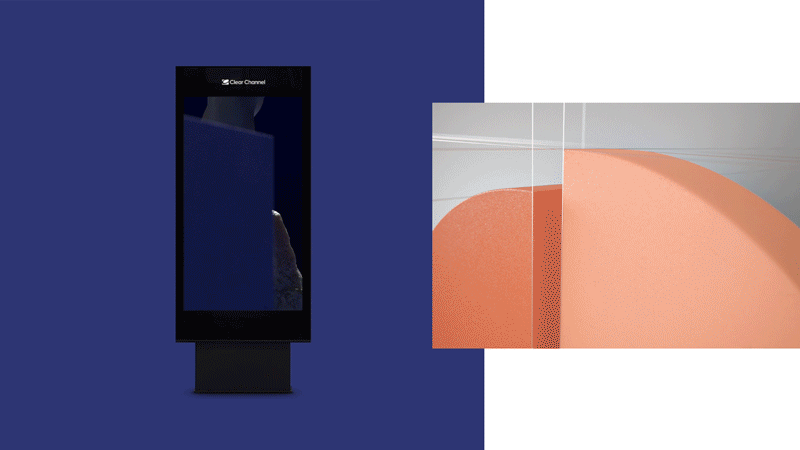
Artist Ian Cheng fosters an emotional and personal bond with data through his digital installation BOB. Data is translated into an attentive, artificial life form on a screen that visitors can physically interact with. This human-technology interaction hints at a future in which people will communicate with and understand AI to enable a more meaningful collaboration. For The Emotional Art Gallery project, digital advertising platform Clear Channel wanted to visually express group data on Stockholm’s underground system. A tailor-made algorithm uses public data such as Google searches, news articles and traffic information to analyse the current mood of the city and decide on a digital artwork to display to positively alter commuters’ moods. Artists including Jesper Lindborg created sensory stimulating imagery that instils feelings of safety, energy or calmness.
Experiencing data and AI on a physical level makes these concepts real and enables a greater understanding of how an individual affects changes in data flows. This helps consumers to understand that these technologies do not operate separately from us; instead, we influence and affect how they behave.
:strip_exif():strip_icc()/filestorage/images/91335/colours3.jpg)
From top: The Emotional Art Gallery project by Clear Channel; Microsoft Ignite branding by Tendril; BOB by Ian Cheng; The Emotional Art Gallery project by Clear Channel
Toolkit
:strip_exif():strip_icc()/filestorage/images/84316/1-self-driving-car-preview.jpg) System Aesthetics by Field; Self-driving Car
System Aesthetics by Field; Self-driving Car
:strip_exif():strip_icc()/filestorage/images/91381/screenshot-2019-04-05-at-17-41-50.jpg) Building Hopes by Accurat for Google
Building Hopes by Accurat for Google
:strip_exif():strip_icc()/filestorage/images/89596/e7c3fe73343905-5c069999eba7f.png) Microsoft rebranding by Tendril
Microsoft rebranding by Tendril
This toolkit reveals the key design cues and treatments to consider when incorporating this design direction into branding, advertising, UI, UX and art direction.
Here we highlight the talent to work with to implement this design direction. These three creative practitioners are leading the way in developing new visual metaphors that represent complex data and technology systems through a combination of digital animation, dynamic typography and informative experiences.
: Creative studio Field is a category leader in creating future aesthetics for design, emotion and experience. The studio is made up of artists, designers and consultants across strategy and branding, moving images and immersive experiences, and has produced digital experiences for a cross-sector of clients including Stella McCartney, Samsung and Toyota
: Having established a diverse client base that includes Gucci, Vodafone and Starbucks, creative information design studio Accurat recognises that data is not just a set of numbers, but a manifestation of people, places, ideas and values. The studio creatively communicates data-heavy information through multiple digital formats that include AR experiences, installations and retail interiors
: Canada-based Tendril works at the intersection between technology and art to create future-facing brand narratives. Its internal R&D lab for AR and VR pushes the boundaries of storytelling and informs digital activations for clients such as Microsoft, Shopify and Nike
Lab Notes
1. Dystopian, technical and space-inspired imagery is outdated, and perpetuates fear and negativity about new technologies. Explore the use of three-dimensional shapes in uplifting colours and sensorial textures to create a new visual language around these ideas.
2. Being transparent about how the technologies you employ actually work is key to building consumer trust. Focus on communicating the functionality and behaviour of these systems, with moving images and animations rather than using an aesthetic that is vague and disguises their sole purpose.
3. Think about how to incorporate reactive typography into your branding and communications to provide an additional layer of information and consumer understanding. Graphic, mutating lettering can have an additional function as an infographic for complex concepts.
4. Real-time interactive and immersive representations of data make this intelligible concept real. Employ virtual reality and artificial life forms to emphasise how this technology is not a separate entity, but responds to human behaviour and is therefore something humans are in control of.
5. Read our Morality Recoded macrotrend to explore how consumers are demanding transparency and how, as a consequence, brands need to open up the black box of AI and create a language that is intelligible to all.
:strip_exif():strip_icc()/filestorage/images/129442/250514-elekid-white-e-withe-void-close-up-16x9.jpg)
:strip_exif():strip_icc()/filestorage/images/129122/lsn-video-thumbnail-template2.png)
:strip_exif():strip_icc()/filestorage/images/127958/main-image.jpg)
:strip_exif():strip_icc()/filestorage/images/125413/small-bolo-058-3-copy.jpg)
:strip_exif():strip_icc()/filestorage/images/123433/prince-mohammed-bin-salman-stadium-exterior-3-populous.jpg)
:strip_exif():strip_icc()/filestorage/images/122691/pitch.jpg)
:strip_exif():strip_icc()/filestorage/images/122082/2.png)
:strip_exif():strip_icc()/filestorage/images/118313/screenshot-2023-09-06-at-16-11-02.png)
:strip_exif():strip_icc()/filestorage/images/112065/acla-tobiassiebrecht-2-2.jpg)